


Santa Cruz Public Libraries App Redesign


Role
Personal Project — UX Designer
Timeline
3 months
Opportunity Space
Reading was my biggest source of joy as a child. Each summer, I participated in my local library’s summer reading contest, where I consistently surpassed the goal. As I got older, I had less time to visit the library, so my trips became more of a quick in-and-out stop. When I graduated college during the COVID-19 pandemic but was still living in my college town, I had a bit more time for leisure reading. And given that we were in the middle of a pandemic, I decided to download the Santa Cruz Public Library’s (SCPL) app to make my literary experience as safe and efficient as possible (…or so I thought).


Problem Statement
Library patrons need an intuitive app that allows them to easily find and access all of their library-related services in one place. The current SCPL app falls short in terms of user experience, with confusing navigation, limited functionality, and a lack of seamless integration.
Research
At first glance, I could see the SCPL app was outdated and lacked basic functionality when compared to its desktop counterpart. It was clearly a poorly maintained and unloved product (possibly in part due to lack of public/government funding). The app constantly crashed and was generally unpleasant to use.
Analysis of the existing platform provided a deeper understanding of the problem, and I was able to define many of the issues plaguing the user experience.

User Reviews
In order to get a further understanding of the user and the issues they experience, I first looked at reviews on the Apple and Google Play stores. Mostly negative feedback highlighted some of the issues I had identified, and some others I had not.

User Research
Due to COVID, all of the user research had to be conducted virtually. I collected a total of 63 survey responses from the target audience — library patrons who have used the SCPL app (ages 17-72). My strategy for gathering responses was to circulate surveys digitally via Nextdoor, an active community platform in the Santa Cruz area.
I lacked the resources for in-depth user research (and meeting in-person was difficult due to the COVID-19 pandemic), but I conducted 5 user interviews. It is intended to understand more about their book borrowing experience, their behavior and the pain points.

2.7

Participant average app navigation rating (based on a Likert scale of 1 - 5)
64%
Participants reported an error when attempting to complete a task on the app

58%
Participants missed tasks (returns, renewals, etc.) or events due to not having reminders
Takeaways
“The app doesn’t provide enough information about library events and workshops. I always end up finding out about them too late or missing out.”
“It feels like I’m always seeing the same suggestions, even though I read a wide variety of books. It would be nice if it understood my preferences better.”
“Trying to find the books I want in the app feels like searching for a needle in a haystack!”
“I often forget to return books on time because the app doesn’t send me reminders. It would be incredibly helpful if there were push notifications or alerts to notify me about upcoming due dates.”
“I decided to stop using the app- navigating through it is just too confusing and not time efficient. I wish it had a simpler layout and clearer categories to help me quickly find the books I’m looking for.”
“I can’t even pay my fines in the app- it reroutes me to the website!”
Affinity Diagram
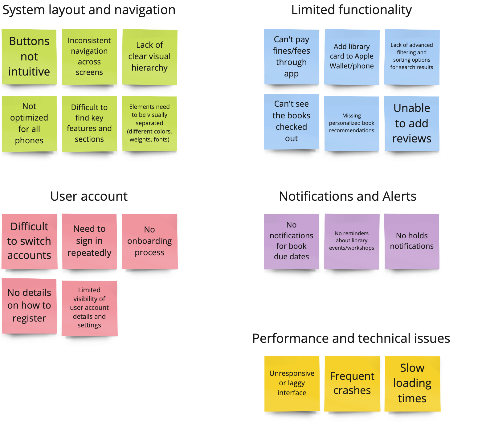
Issues Identified
#1 System layout and navigation
Outdated and inconsistent system layout & navigation. There are many spacing and sizing issues, as well as inefficient use of screen real estate and information hierarchy issues.
#3 Limited functionality
App does not reasonably match the functionality of desktop site. The search and browse features are skeletal, and discoverability of many aspects of the app is poor. Notifications are only available by email, and user cannot add reviews or engage with the community.
#2 User account
Lack of onboarding process & efficient account switching. Personal details have no dedicated section, no personal touch throughout app creates an unfriendly experience.
Design Recommendations Based on User Feedback
Intuitive Structure
Create a simplified and natural feeling architecture of information and navigation.
1
Consistency
Create a design language to optimize spacing, contrast, text sizing and discoverability of features.
User Account
Implement easy-to-follow onboarding and accessible account information.
Functionality
Add notifications, comprehensive search and community features.
2
3
4
User Flow

Re-organizing the layout of the app’s features was a high priority task. The existing information architecture made it difficult to find what you were looking for, account info was a bit scattered, and navigation was counter-intuitive and lacked modern, user-familiar patterns.
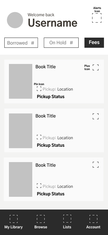
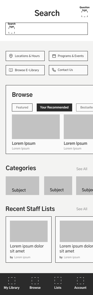
Through an iterative process, I opted for a simple 4 tab bottom navigation. In the first tab was the most relevant info to the user — their current borrowed items and fees — and secondary features available throughout the other 3 tabs: Search, Lists & Account.


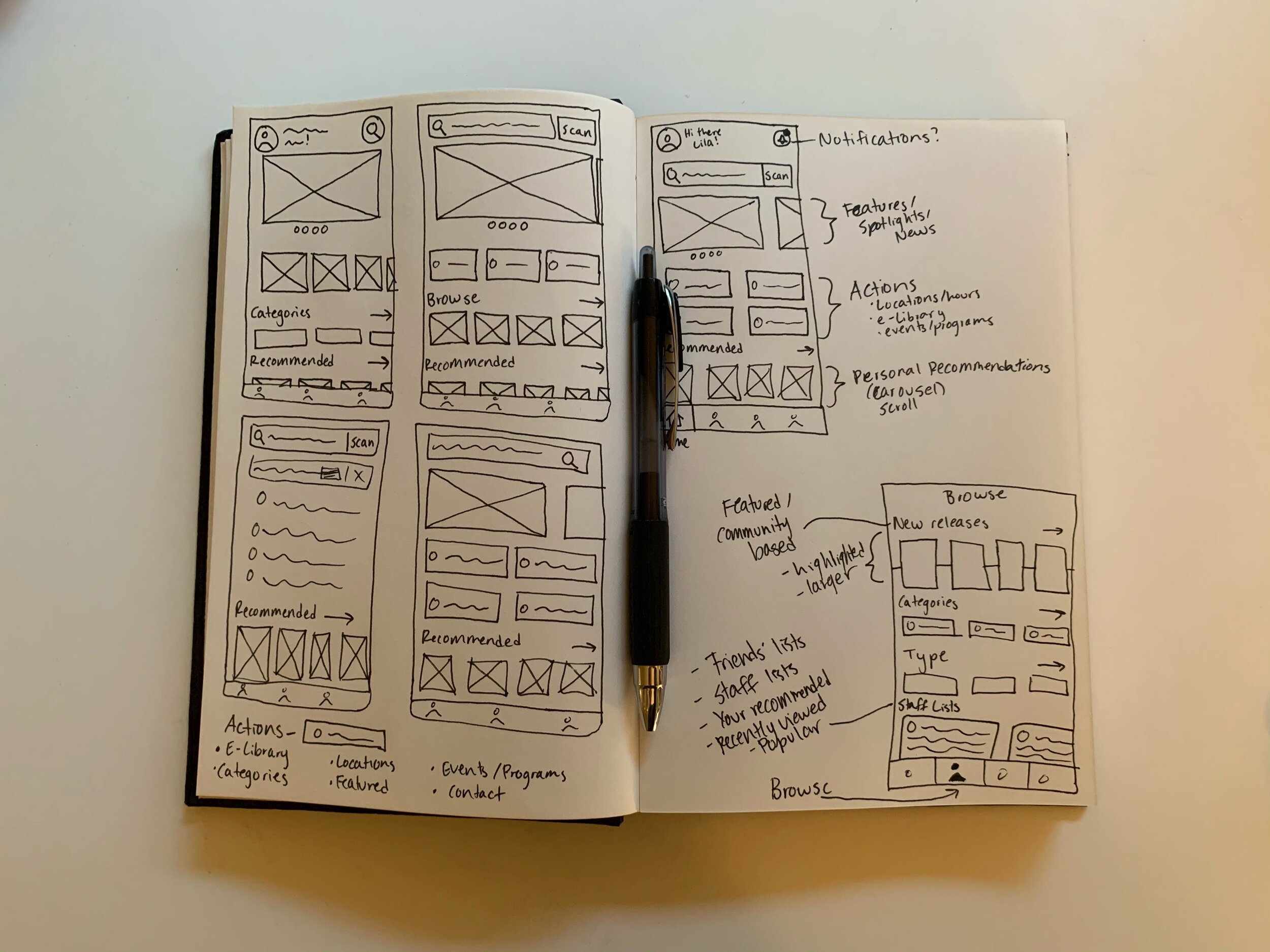
Low-Fidelity Wireframes
Wireframing began with pen and paper until enough structure was in place to start mocking up low fidelity screens in Figma.


Final Design
The final design consists of a simple, expandable design system with a playful yet elegant look. Along with fixing the many issues I identified in research, I wanted to create something that was enjoyable and inviting to use.
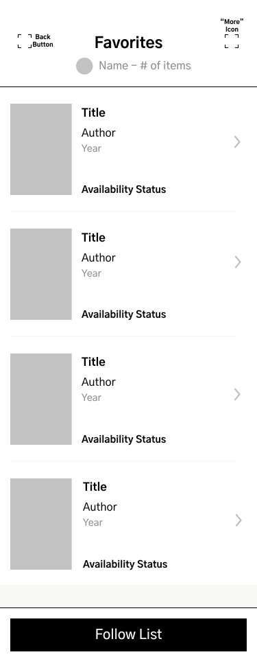
Intuitive Navigation
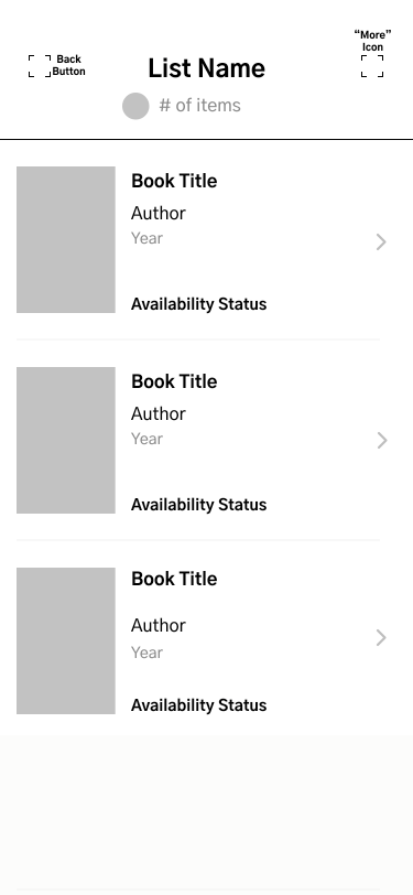
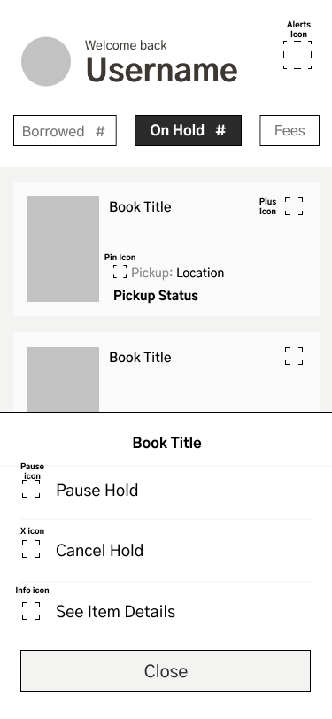
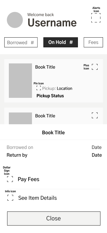
A simpler layout prioritizes the user’s personal items in the ‘My Library’ tab, so the most important info is quickly accessible. Item availability info is easier to view, and renewing items, placing holds, and paying fees can be done with just a few taps.
The addition of in-app notifications means the user is alerted of impending fees and due dates, as well as important library updates and promotions.

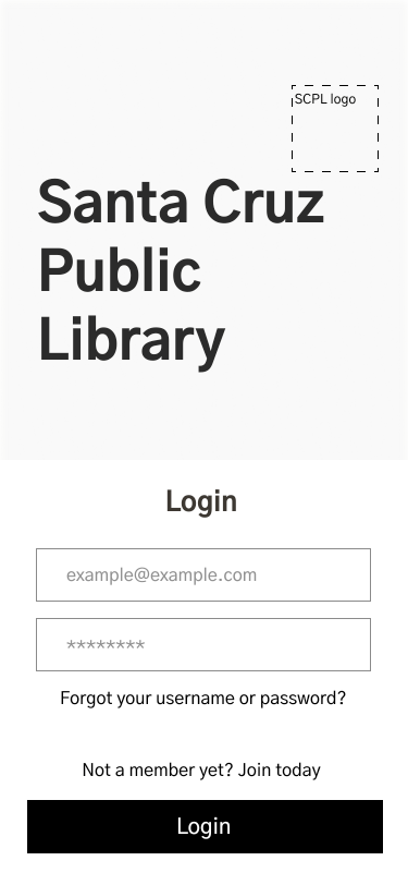
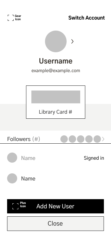
User Account
One of the major issues with the app was the scattered user account info. It can all now be found in one place, with an optimized login process and account switching flow.
Previously the app required you to sign in repeatedly, and the ‘remember me’ option recalled both the username and password, which is an obvious security risk. Users should be able to stay signed in and access the app with a passcode or biometrics.

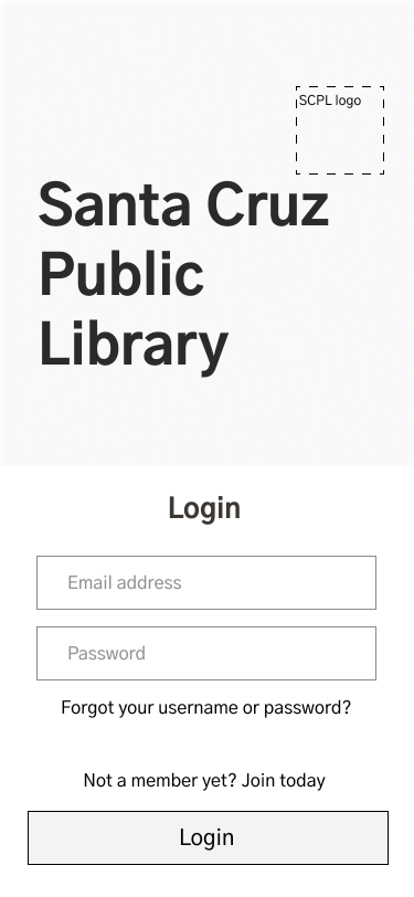
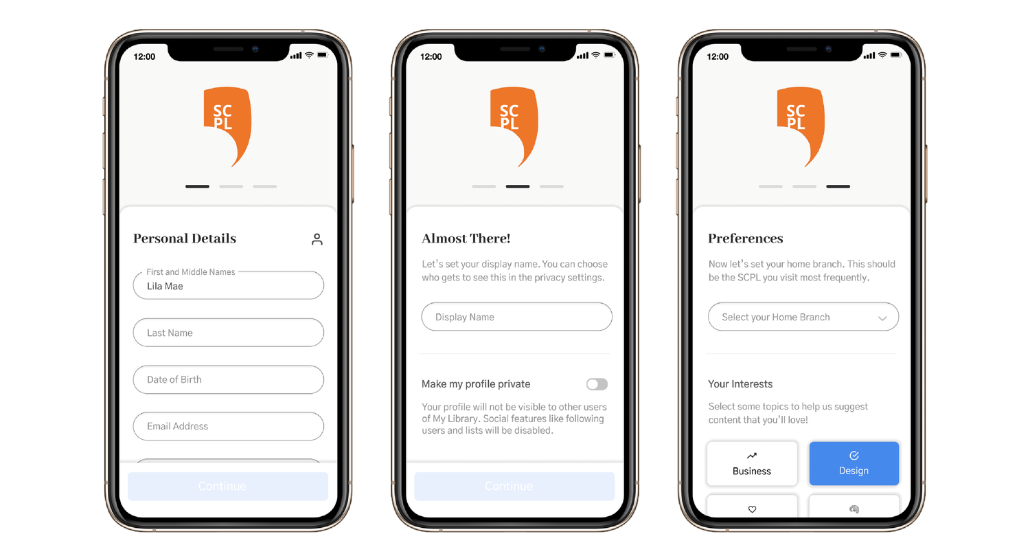
Onboarding
Another major issue was the lack of sign-up information. An added onboarding flow helps to guide users through the sign-up process quickly and easily. The app can also recommend the user content that they might like based on selected interests and borrowing history. Of course, users have the option to make their profile private and invisible to other users on the platform.
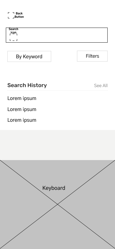
Search Overhaul
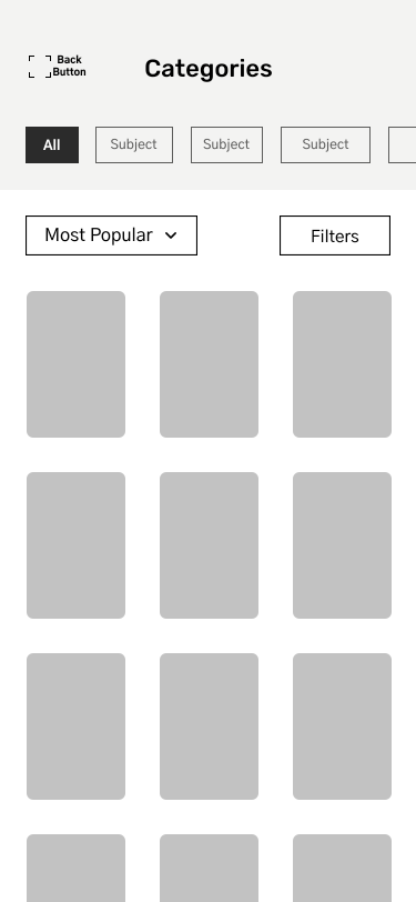
Filters and search results have been optimized to provide an intuitive search experience, so as to find what you’re looking for fast.
Browsing is much more enjoyable, and discovering new material you’ll love is now possible with personalized suggestions. Community engagement is also possible with the ability to follow friends and their curated lists.

First-Time User Experience
While return users are automatically routed to the “My Library” page upon sign-in, first time users land on the “Browse” page. This allows them to see the books that have already been recommended for them, thus being able to take full advantage of the app straightaway.

Prototype
Conclusion
In conclusion, the journey of redesigning the Santa Cruz Public Library's (SCPL) app has been an enlightening and rewarding experience. As someone who cherished the joy of reading since childhood, I could personally relate to the need for an intuitive platform that enhances the literary experience for library patrons. Looking ahead, if given the opportunity to test and validate these redesigned app features, the next steps would involve conducting usability testing with real users. By observing and gathering feedback during the testing phase, we can identify any remaining pain points and fine-tune the app's functionality and design based on user preferences. Furthermore, the plan for future development includes continuous iteration and improvement based on user feedback and changing needs. Introducing more personalized recommendations, leveraging AI-driven algorithms, and integrating community-driven features could enhance the app's appeal and engagement. As I continue to refine and evolve this experience, the vision of a seamless and enriching literary journey for all library patrons remains the driving force.

lilahunterreay@gmail.com